Colours & Finishes · 3 min read
The Most Popular RAL Colours for Windows and Doors
A small handful of RAL codes account for the great majority of window and door orders. Here is what they are, and why each keeps being chosen.
Collections
Specification
Colours & Finishes · Flagship guide
Frame colour is the single decision that does more to a house's character than almost any other, and it is one of the hardest to reverse once glazing is installed.
Written by Windows in the Lakes · A trading name of Home Glazing Ltd · Last reviewed 21 September 2026
Window colour should be chosen against the building's own materials and the way daylight falls on each elevation, not from a swatch viewed indoors. Dark greys and anthracite recede and suit stone, render and contemporary extensions; off-whites and heritage colours suit period properties and painted joinery; jet black is the least forgiving and needs well-proportioned openings. Decide separately whether the internal face should differ from the external, and view physical samples outside, at the house, in daylight.
Ask most homeowners what they want from new windows and they will talk about performance: warmth, security, quiet rooms. Ask an architect what they notice first about a house and it is almost always colour. A well-proportioned Georgian farmhouse in the wrong grey looks corporate. A modest 1970s bungalow in the right anthracite looks considered and current. Colour is doing more work than most people budget time for.
This guide sets out how to choose a frame colour methodically rather than emotionally, covers the RAL system that the whole industry uses to specify colour, and works through the practical trade-offs between finish types, elevations, orientation and planning constraints. It draws on the same reference points used across our Colours Studio, so wherever a specific RAL code or finish is mentioned you can look it up in more detail there.
It is not a guide that will tell you black is always right, or that white is always safe. Both are true and false depending on the building. What follows is a way of thinking that gets you to the right answer for your specific house, elevation and budget.
Frames occupy a surprisingly large proportion of a house's visible surface area once you count reveals, cills and the negative space between panes. On a typical elevation, frame and trim colour can account for 15–30% of what the eye actually reads as 'the building', even though glass makes up most of the physical opening. Get this wrong and no amount of careful brickwork or landscaping will fully compensate.
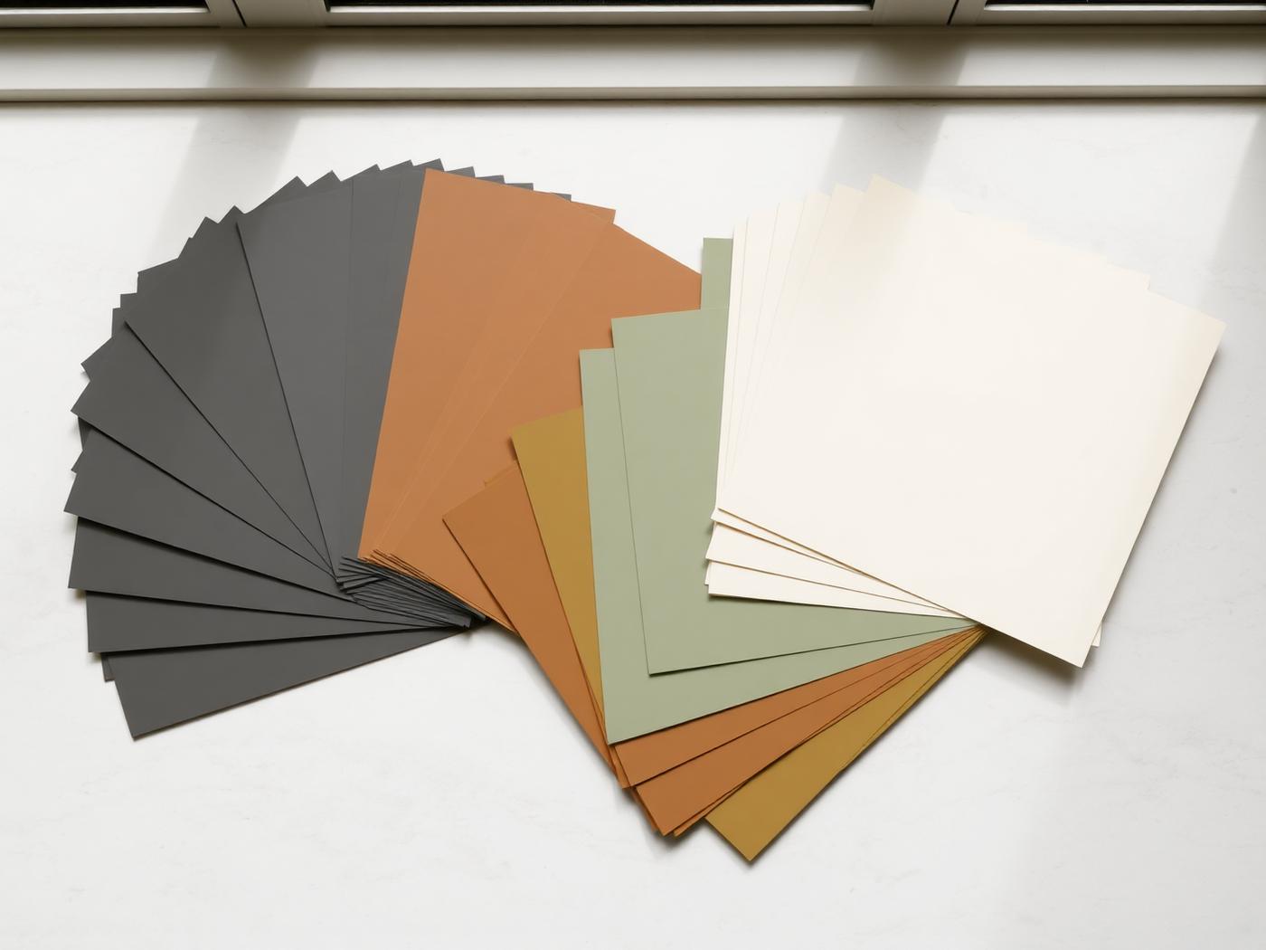
Colour choice also interacts with light in ways that are easy to underestimate from a swatch. A sample the size of a beer mat, held indoors under artificial light, tells you almost nothing about how a 2.4 metre frame will read on a north-facing gable in flat Cumbrian light versus a south-facing wall in the low winter sun. Anthracite grey (RAL 7016) can look almost black on a shaded elevation and noticeably lighter and warmer on a sunlit one.
RAL is a European colour matching system, originally developed in Germany, that assigns a unique four-digit code to a defined shade. It removes the ambiguity of names like 'graphite' or 'slate', which mean different things to different manufacturers. When a fabricator specifies RAL 7016, every polyester powder coating supplier in Europe knows exactly which grey they mean, which is what allows you to match window frames, gutters, garage doors and gates from entirely different manufacturers with confidence.
Codes are grouped by hue: the 1000s are yellows, 3000s reds, 5000s blues, 6000s greens, 7000s greys, 8000s browns and 9000s are the whites, blacks and greys at the extremes of the scale. Within architectural glazing, the overwhelming majority of orders fall into a narrow band of the 7000 and 9000 series, plus a handful of heritage greens and browns from the 6000 and 8000 series.
| Series | Colour family | Typical use on glazing |
|---|---|---|
| 7000s | Greys | The default modern palette: anthracite, agate, window grey |
| 9000s | Whites and blacks | Jet black, traffic white, papyrus white, signal black |
| 8000s | Browns and bronzes | Heritage and countryside properties, bronze-look aluminium |
| 6000s | Greens | Traditional and conservation-area appropriate frames |
| 3000s | Reds | Occasional feature doors, rarely whole-house glazing |
Most aluminium and Residence Collection systems are finished in polyester powder coat, applied electrostatically and cured at high temperature, which gives a durable, UV-stable finish that should hold its colour for well over two decades with normal maintenance. Anodising is an alternative finish available on some aluminium systems, producing a slightly different, more metallic depth of colour, though the colour range is narrower than powder coating.
The most reliable way to choose a colour is to work outwards from the fixed, expensive-to-change elements of the house: the stone, brick, render colour and roof material. These are your constants. Frame colour is the variable you are solving for.
Cumbria's building stock is unusually varied for the area it covers: whitewashed farmhouses, coursed rubble stone cottages, Georgian townhouses in Kendal and Penrith, Victorian villas, and a growing number of contemporary new builds and extensions. Each responds differently to frame colour.
| Property type | Strong starting options | Approach |
|---|---|---|
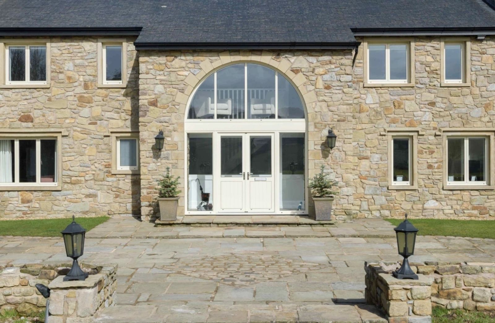
| Cumbrian stone cottage | RAL 7016 anthracite, RAL 6009 fir green, RAL 9005 black | Tonal or heritage contrast; avoid stark white |
| Whitewashed / render farmhouse | RAL 9005 black, RAL 7016 anthracite, RAL 7022 umbra grey | High contrast reads as confident and current |
| Georgian / period townhouse | RAL 6009 fir green, RAL 9005 black, RAL 8017 chocolate brown | Heritage tones respect conservation-area expectations |
| Victorian villa | RAL 7015 slate grey, RAL 9005 black, RAL 3005 wine red on a door | Darker frames with a single accent colour on the entrance door |
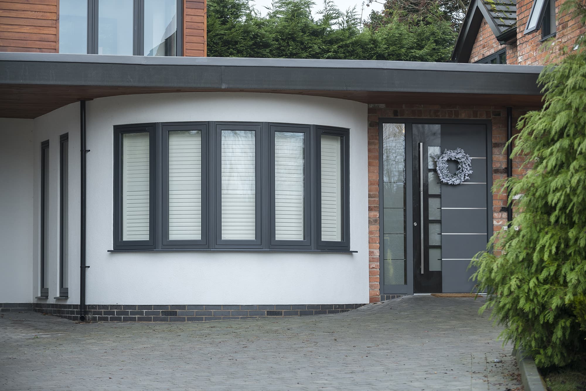
| Contemporary new build | RAL 7016 anthracite, RAL 9007 grey aluminium, RAL 9005 black | Minimal palette, often matched across windows, doors and cladding |
| Coastal or exposed elevation | RAL 7016, RAL 7024 graphite grey | Darker greys mask weathering and salt residue better than pale tones |
Dark frames absorb more solar radiation than light ones, which has two practical consequences. First, on large south or west-facing elevations, very dark aluminium can run noticeably warmer to the touch in direct summer sun; reputable systems account for this in their thermal design, but it is worth mentioning to your supplier if you are specifying floor-to-ceiling dark frames on a sun-facing wall. Second, dark frames show dust and pollen less than pale ones, but show water spotting and bird activity more, an unglamorous but real maintenance consideration.
White and pale grey frames are the lowest-maintenance choice in terms of visible dirt, but on a semi-rural Cumbrian property they can start to look institutional rather than characterful within a few years, particularly against natural stone. This is a matter of taste, not performance, but it is the single most common reason we see homeowners regret a colour choice.
If your property sits within a conservation area, in the Lake District National Park, or is listed, colour may not be entirely your choice to make. Conservation officers commonly favour traditional dark colours (black, dark green, chocolate brown) over bright white or unusual modern greys, and will often ask for evidence of the historic colour if you are replacing existing joinery on a listed building.
It is worth raising colour with the planning authority or your architect at the same time as material and profile, rather than treating it as a detail to settle later. A scheme that is approved for timber-look aluminium in RAL 6009 fir green can be refused, or delayed, if the applicant later tries to switch to a stark white without going back to planning.
Where a period property calls for the character of timber but the owner wants the low maintenance of aluminium or Residence uPVC, woodgrain foils and textured powder coats replicate the grain and depth of painted or stained timber convincingly at typical viewing distance. Golden Oak, Irish Oak, Rosewood and Walnut are the most requested foils, alongside a growing interest in anthracite-grain finishes that combine a woodgrain texture with a contemporary grey base colour.
Textured, matt powder coats (sometimes described as 'structura' or sandtex-style finishes) are a separate option: not woodgrain, but a fine texture applied to standard RAL colours such as anthracite or black, which softens reflections and reduces the visibility of fingerprints and minor scuffs on entrance doors and high-traffic hardware.
It is easy to focus entirely on kerb appeal and forget that frames are also an interior finishing element. A dual-colour system, standard on most aluminium and Residence ranges, lets you specify a dark, confident colour externally, such as RAL 7016 or RAL 9005, while choosing a lighter internal finish such as RAL 9010 pure white or RAL 9001 cream that suits the room's decoration and reflects more daylight.
This is discussed in more depth in our internal colours guide, but the principle is straightforward: external colour should respond to the building and any planning constraints, while internal colour can be treated more like a paint choice, matched to skirting, doors and trim already in the house.
Standard RAL colours from the core palette, typically anthracite, black, white and a handful of greys, carry no premium on most systems and are held in stock finishes by fabricators, keeping lead times shorter. Less common RAL codes, dual-colour combinations, metallic or anodised finishes and woodgrain foils are usually a special-order item, adding a modest surcharge, commonly in the region of 5-12% of frame cost, and one to three weeks to the programme.
As a guide, an aluminium casement window supplied and installed typically runs from roughly £1,400 to £2,600, and colour choice within the standard range does not usually move that figure meaningfully. Bespoke metallics and heritage textured finishes sit towards the top of that range or slightly above it. Always ask for colour cost to be itemised on your quotation so you can compare like for like.
If you take one thing from this guide, make it this: order a genuine sample panel before you commit, and view it against your own walls in your own light. Beyond that, anthracite grey (RAL 7016) remains the safest, most versatile starting point for the great majority of Cumbrian properties, stone or render, traditional or contemporary, while jet black (RAL 9005) suits properties that can carry a bolder, higher-contrast look. Heritage greens and browns remain the right answer for period and listed buildings, particularly where planning guidance points that way.
“Colour is the one specification decision a homeowner will live with every time they look at their house from the street. It is worth the extra week it takes to get a proper sample panel made.”
Next step
We design, specify and install across Cumbria, the Lake District and the wider North. Send drawings, photographs or simply a description of the building and we will tell you what is possible and what it should cost.
Explore from here
Save anything you are drawn to. It gathers in My Inspiration and travels with your enquiry as a design brief.
Questions
If your question isn’t here, we would rather talk it through properly than guess.
Book a Design ConsultationVisit the Knowledge CentreKeep reading
Colours & Finishes · 3 min read
A small handful of RAL codes account for the great majority of window and door orders. Here is what they are, and why each keeps being chosen.
Colours & Finishes · 3 min read
Bronze aluminium and anthracite grey are the two most common answers to the same brief: a warm, contemporary neutral that is not black and not white.
Colours & Finishes · 3 min read
Black frames give the strongest possible contrast against a pale wall, which is exactly why they suit some houses beautifully and overwhelm others.
Product Comparisons · 3 min read
Anthracite Grey and Jet Black are the two most requested dark frame colours, and homeowners often assume they are interchangeable. Side by side, they are not.
Build your own collection of expert advice as you plan your project.
Wondering how this applies to your own home?
Share a photograph and we’ll turn this guidance into recommendations for your property.
Ready to understand the likely investment?
Start your personalised Project Investment Guide and see comparable completed projects.
Begin
Bring us your drawings, your site photographs or simply an idea. We will tell you what is possible, what it should cost and how long it will take.